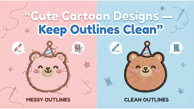
Cute Cartoon Designs — How to Keep Outlines Clean
Cute cartoon embroidery designs continue to dominate kids’ fashion, custom patches, hoodies, tote bags, accessories, and boutique merchandise. These designs rely heavily on polished outlines that define expression and charm. Even the most beautifully filled cartoon looks distorted if the outline becomes wavy, jagged, or misaligned. That’s why mastering outline digitizing is crucial for producing clean, modern cartoon embroidery.
Before diving into technical stitching principles, many digitizers study clean-outline artwork references such as outline-based vector graphics, which help them understand how shapes should look before converting them into stitches. Similarly, exploring cartoon line art tutorials like this detailed guide on cartoon outlines can improve your drawing style before digitizing. For embroidery-specific inspiration, browsing applique categories such as cute butterfly embroidery designs, cartoon applique designs, or vehicle-themed embroidery sets will help you observe how clean outlines behave in stitching.
To see real stitching results and outline behavior in motion, you can also watch demonstrations like this cartoon embroidery outline tutorial and this beginner-friendly outline stitching guide. Observing live stitching makes it easier to understand how stabilizers, tension, density, and pull compensation affect outlines.
1. Match Fill Direction to the Outline Flow
The number one cause of crooked cartoon outlines is fill stitches pulling in the opposite direction of the border. When the underlying fill pulls horizontally and the outline follows a vertical arc, the outline becomes warped or compressed.
To prevent distortion:
- Choose fill angles that support the outline shape instead of opposing it.
- Use circular or radial angles for round cartoon cheeks and heads.
- Avoid long, single-direction fills that stretch fabric unevenly.
When the fabric stays stable and tension aligns with the outline flow, the satin border settles smoothly on top, resulting in clean and consistent outlines.
2. Use the Right Pull Compensation for Clean Curves
Cartoon outlines almost always use satin columns, which naturally pull inward while stitching. Without proper pull compensation, curves like eyes, cheeks, ears, and mouth corners appear thinner or uneven once stitched out.
Recommended pull compensation ranges:
- 0.2–0.4 mm for tight curves
- 0.15–0.25 mm for medium curves
- Lower values for straight borders
The goal is balance—too little pull comp produces wobbly outlines, while too much makes them thick and clumsy. Cartoon designs look best with bold yet controlled borders that hold their width consistently around the character.

3. Avoid Overly Dense Satin Borders
A dense satin border may look good on-screen, but on fabric it can cause puckering, thread buildup, or bumpy edges. Cartoon characters tend to use soft, rounded shapes, which require flexible, breathable satin stitching.
Ideal satin outline densities:
- 0.35–0.45 mm for normal outlines
- 0.50 mm for bold borders
- Avoid tight densities on knits or stretchy fabrics
A balanced density enhances durability while maintaining smoothness, preventing the borders from buckling or warping.
4. Digitize the Outline Last
The stitching order is one of the most critical steps in cartoon digitizing. If the satin outline is stitched before the fills, the fill stitches will push the border out of place or partially cover it. This destroys the clean outline look people expect from cartoon embroidery.
Use the correct sequencing approach:
- Underlay (if needed)
- Base fills first
- Secondary fills (cheeks, clothes, small shapes)
- Detail work (eyes, mouth, tiny accents)
- Satin outline last
Digitizing the outline last creates a polished “sticker-style” finish—one of the most popular aesthetics in cartoon embroidery today.
5. Use Short Stitch Length on Small Curves
Cute cartoon designs often include tiny strokes and rounded features: small paws, mini bows, cheek curves, or expressive eye shapes. Long stitches cannot form smooth curves in these areas and will cause jagged or blocky borders.
Recommended stitch lengths:
- 0.8–1.2 mm for tiny curves
- 1.5 mm for medium curves
- 2.0 mm for long or straight lines
Shorter stitches help the border bend gracefully around curves, giving the outline a natural, fluid cartoon look.
Final Tip: Keep the Outline Width Consistent
Consistency is the hallmark of well-digitized cartoon outlines. Whether your cartoon includes stars, faces, accessories, or character limbs, the outline thickness must remain the same unless intentionally varied for stylized effects.
Optimal outline widths:
- 1.8–2.2 mm for bold outlines
- 1.4–1.6 mm for medium outlines
- 1.0–1.2 mm for small patches
Maintaining uniform border thickness ensures visual harmony and professional quality throughout the entire character.
Conclusion
Clean cartoon outlines come from technical precision—balanced fill direction, proper pull compensation, moderate satin density, short curve stitches, correct sequencing, and consistent outline width. These fundamentals ensure that the borders stay smooth, bold, and stable, giving your cartoon designs a crisp and highly marketable finish.
By studying real cartoon artwork, watching outline stitching tutorials such as this video and this in-depth guide, and exploring embroidery applique styles like cartoon appliques, you can elevate your cartoon embroidery skills dramatically. Whether you're creating kawaii characters, mascots, or playful icons, mastering outline control ensures your designs always look modern, crisp, and professional.

Leave a comment