Floral Designs: Why Some Look Flat & Others Look 3D
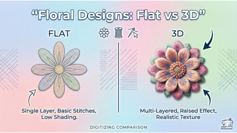
Floral embroidery continues to be one of the best-selling design categories across boutique fashion, couture garments, home décor, children’s clothing, accessories, and festive wear. With such universal appeal, the demand for high-quality floral motifs has never been higher. Yet many designs still look flat, lifeless, or lacking dimension — while others immediately stand out with rich 3D shaping, soft gradients, and visually striking depth.
To understand how real 3D floral embroidery is created, explore motif references such as leaf-based applique embroidery and petal structures used in flower vine applique patterns, which showcase how natural flow and shading dramatically change stitch appearance. You can also examine multi-layered floral formations like flower bunch applique designs or popular single-flower motifs such as boutique floral embroidery to observe why certain designs appear naturally dimensional.
For deeper understanding of petal structure and realistic shading, motifs like the rose flower embroidery style and lotus flower applique patterns highlight how layered petals create beautiful shadow depth. Larger motifs, such as big flower embroidery patterns, also demonstrate why density, underlay, and stitch direction become even more important in oversized 3D floral designs.
For a more visual breakdown, you can also refer to this 3D floral embroidery explanation video, which helps show how petals gain shape through shading, layering, and stitch flow.

1. Missing Shading Layers = Flat Flowers
One of the most common causes of flat embroidery is insufficient shading. Many beginners use a single-tone fill for each petal, ignoring the natural highlight, mid-tone, and shadow variations present in real flowers. Without tonal transition, petals look plain and lack depth.
For realistic 3D floral embroidery, you need:
- Highlight – creates lifted appearance
- Mid-tone – main color of the petal
- Shadow – adds contour and depth
Some premium digitizers even use 4–5 shades from the same color family to give a more natural, curved look. Shading is the foundation of realistic floral dimension.
2. Incorrect Stitch Direction Removes Natural Depth
Stitch angle is one of the strongest visual storytelling tools in floral digitizing. The direction of the stitches determines how the eye flows across the petal. If stitch direction follows the natural curvature of the petal, the flower looks soft, realistic, and expressive.
Correct stitch direction helps create:
- Smoother contour
- Natural visual motion
- Soft gradient transitions
Incorrect or stiff stitch angles flatten the design, no matter how good the artwork is. Smooth angle blending is key for making petals appear curved.
3. No Underlay Means No Petal Structure
Underlay acts as the backbone of embroidery. Without it, petals can appear uneven or sunken into the fabric. Proper underlay adds structure, lift, and crispness.
For 3D floral embroidery, the best underlays include:
- Edge-walk underlay – defines the border sharply
- Center-run underlay – lifts the middle area for curved shaping
These underlays together create stability and gentle elevation, resulting in petals that look naturally raised rather than flat.
4. Low Density Creates Hollow & Flat Areas
While reducing density can prevent stiffness, lowering it too much can make your floral designs appear hollow, patchy, or washed-out. Realistic 3D embroidery requires balanced density to maintain texture and richness.
Balanced density ensures:
- Smooth surface texture
- Uniform thread coverage
- A slight natural lift
- Strong structural stability
Underfilled petals show fabric underneath and lose their dimensional quality, especially in large designs.
5. Color Palette Not Matching Natural Gradients
A 3D floral design is incomplete without the right color palette. Even perfect shading and angle work fall apart if the colors don’t blend well together. Real flowers have smooth, subtle transitions, never harsh jumps.
A professional floral palette typically includes:
- Light highlight
- Medium highlight
- Mid-tone
- Shadow
- Deep shadow (optional for strong realism)
Colors must belong to the same tonal family for a natural gradient. Abrupt color differences break realism.
Final Tip: Layer Petals for True 3D Depth
True 3D floral embroidery comes from layered digitizing. Petals should not sit on the same visual level — instead, they must be stacked strategically.
Follow this sequence for best results:
- Digitize outer petals first
- Digitize inner petals next
- Add highlight and shadow stitching last
This creates natural depth, visual separation, and realistic petal stacking. When combined with shading, underlay, and correct stitch direction, the flower transforms into a premium 3D artwork.
Conclusion
Flat floral embroidery is usually the result of missing shading layers, incorrect stitch direction, weak underlay, low density, or mismatched color gradients. On the other hand, 3D floral designs incorporate multi-tone shading, layered structure, smooth stitch flow, proper underlay, and natural color transitions. Mastering these techniques ensures your floral embroidery looks lifelike, premium, and highly sellable across global markets.

Leave a comment