Why Your Monogram Designs Look Uneven — Real Fixes
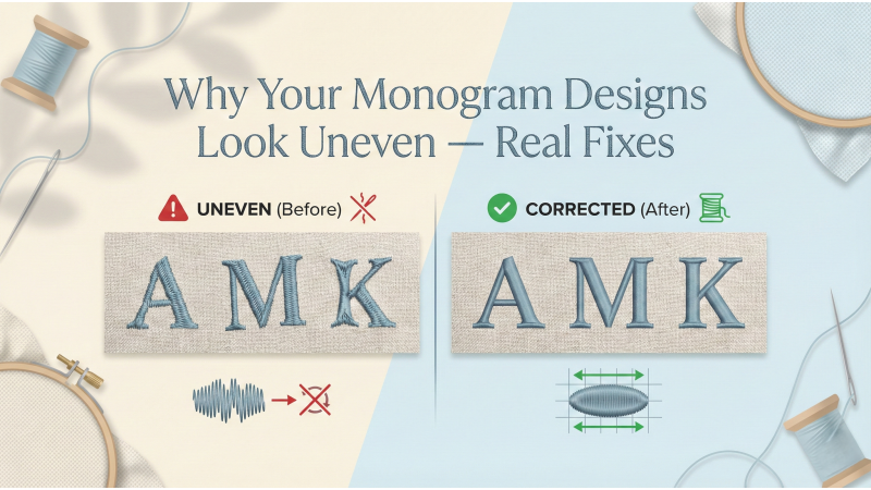
Monogram embroidery feels like stitching tiny signatures of elegance onto fabric — initials that whisper personality, tradition, and luxury. But when those letters appear uneven, distorted, or off-balance, the final piece loses its charm. Uneven monograms aren't random; they arise from very specific technical issues. In this expanded and interlinked guide, you’ll learn the true causes of uneven monograms and how to correct every one of them with precision.
To deepen your understanding, helpful resources are woven naturally throughout — from stabilizer guides at EmbLibrary to digitizing corrections at Embroidery Legacy, and fabric-handling insights from Crewel Ghoul. You’ll also find placement and monogram design help at Maggie Frames, letter-stitch tutorials from Embroidery Hoop Store, and compensation strategies from the pros at Wilcom. And for visual learners, helpful demonstrations from YouTube creators — such as this monogram stitching short, a density explanation video, a stabilizer lesson, and a hooping technique guide — accompany the concepts beautifully.
1. Uneven Density in Each Letter
Density is the heartbeat of a clean monogram. When each letter in a monogram set carries a different density, the result looks instantly unbalanced:
- One letter appears darker
- Another looks too thin
- A third has weak coverage
This happens frequently when monogram letters come from different digitizers or mixed font packs. Even a difference of 0.03 density can visually disrupt the entire design.
Fix:
- Choose monogram sets digitized with consistent density across all letters.
- If digitizing yourself, match the density manually.
- Test-stitch letters to check how each behaves on your fabric.
- Use expert technique recommendations found in resources like this detailed monogram letter guide.
2. Wrong Pull Compensation
Pull compensation is the invisible “counter-force” that keeps satin stitches from shrinking inward. Without it, curves collapse, strokes get thin, and letters lose their shape. Monograms, being compact but dense, magnify this problem.
Symptoms of poor compensation:
- Letters look narrower than on screen
- Round letters distort
- Satin edges look pulled inward
Proper compensation ensures the stitched outcome matches the digital artwork. Valuable insights and examples are explained in depth by Embroidery Legacy and the technical overview at Wilcom.
Fix:
- Add appropriate compensation when digitizing monograms.
- Choose monogram fonts from reputable digitizers who include compensation.
- Test individual letters before stitching a full set.
3. Letters Not Digitized in the Same Style
Some monogram sets online are inconsistent — satin letters mixed with fill stitch letters, or inconsistent underlay styles within a single alphabet. This makes even perfectly aligned letters appear mismatched.
Fix:
- Select monogram sets digitized in the same stitch type.
- Ensure consistent underlay, density, and outline style.
- Check design previews carefully before buying.
Referencing format guides can help you evaluate stitch structure more clearly. Watching a breakdown like this stitch explanation video makes it easier to spot inconsistencies before they ruin your work.
4. Incorrect Stabilizer for Thin or Stretchy Fabric
Fabrics like knits, polos, stretch-wear, baby clothing, and delicate blends behave like living material — they stretch, relax, bounce, and shift under the needle. Without the right stabilizer, even a perfectly digitized monogram will warp.
A reliable stabilizer-selection guide can be found at EmbLibrary, while stretch-specific handling techniques are provided in Crewel Ghoul’s tutorial on stretchy fabrics.
Fix:
- Use cut-away stabilizer for knits and stretchy fabrics.
- Use tear-away only for firm, woven fabrics.
- Add temporary adhesive stabilizer for delicate or small items.
- Use two layers for unstable or thin fabrics.
5. Poor Hooping or Fabric Slack
Hooping is architecture. If the foundation is loose, the structure collapses. Even slight slack in the hoop causes satin stitches to wander or distort. Monograms exaggerate this issue because of their compact size.
See practical hooping demonstrations such as this hooping technique video, where small alignment issues become visible in real time.
Fix:
- Ensure fabric is drum-tight in the hoop.
- Avoid wrinkles or depressions inside the hoop.
- Use adhesive stabilizer when hooping isn't possible (collars, cuffs, napkins).
- Align grain direction before hooping.
6. Incorrect Letter Spacing
Even beautifully stitched letters can look crooked if the spacing is inconsistent. Spacing errors are one of the most common aesthetic problems in monogram embroidery.
Placement guidance and layout ideas are well explained in this monogram placement guide, which helps you visualize where letters should sit and how far apart they should be.
Fix:
- Manually adjust spacing inside your embroidery software.
- Use pre-built monogram layout templates.
- Do a printed preview before stitching.
7. Using Low-Quality Thread
Thread quality affects shine, tension, texture, and durability. Inferior thread makes satin stitches look rough, inconsistent, or uneven — all of which destroy the clean, luxurious look expected in monograms.
Fix:
- Use premium rayon or polyester embroidery thread.
- Ensure good-quality bobbin thread for even tension.
- Avoid expired or brittle thread cones.
Bonus: Incorrect Underlay Structure
Underlay is the secret skeleton of monogram embroidery. Without it, the top stitches have nothing to sit on, causing jagged edges, collapsed satin areas, and loss of definition.
Fix:
- Use edge-walk underlay for crisp satin borders.
- Add zigzag underlay to lift the stitches.
- Match underlay density to fabric thickness.
Watching real-time underlay behavior, such as in this stabilizer and underlay video, helps build intuition on how underlay affects the final outcome.
Final Thoughts
Uneven monogram designs aren’t machine errors — they’re signs of density mismatches, inadequate pull compensation, inconsistent digitizing styles, fabric instability, poor hooping, or incorrect spacing. The good news? Every single issue is fixable.
By choosing well-digitized monogram sets, stabilizing correctly, hooping firmly, balancing density, and applying proper compensation, your monograms will be consistently smooth, balanced, and luxurious.
To take your monogram skills even further, explore additional tutorials such as this stitch lesson and this monogram demo. Each small improvement adds up to a masterpiece.
Precision is what makes monograms timeless — stitch them with intention, and they elevate every garment into a personalized treasure.



Leave a comment